By which I mean MY house, because any house I’m in is the Opera House. And you know, lockdown, so that we don’t all die. So far so good on that front, but if I develop a fever mid review I’ll let you know. I’m not going to talk about that in any great depth because I’m one of the lucky ones. I have a stable job which I can do from home, and actually prefer to do so. I don’t have any children to homeschool. I’m not lonely because I hate everyone anyway. (Just kidding! Or am I? I’m actually not sure.) I have my Beloved and my three cats and that’s plenty. But in a very real way, this is kinda the world that my brain was made to live in. Like I say: lucky.
It’s also a time of fewer excuses. The grumbling begins. Hey, Cantatrice. Didn’t you get the Diamine Inkvent calendar, Cantatrice? Huh? Didn’t you? Aren’t you a slavering Diamine fangirl, CANTATRICE? Why haven’t you written about those lovely inks yet?
And the answer is… I dunno… because there were 25(1) of them and that’s a whole lot of review and I’m kinda lazy? It’s certainly not because I’m in any way unenthusiastic about the Inkvent thing. In fact, when it was released last autumn (that is, a thousand years ago when we were allowed to go outside) I squeed so loudly that cattle fell over in Sussex. And then I got on to a few friends and hinted(2) that maybe they might like to group together and get me this lovely thing for my birthday?
The boom in weird advent calendars is quite a thing at the moment. There are whiskey ones, lego ones, makeup ones, ceremonial gourd ones, assault rifle ones, and the old fashioned chocolate ones. And now there’s ink, in cute little 7ml bottles. I am a total sucker for a mystery box. I was the kid at the summer fete who lurked weirdly around the lucky dip. I sometimes buy wax melts from Yankee Candle. There was a time when the shop was selling mystery bags with three different random wax melts and I was ALL OVER that shit. I wanted ALL the mystery bags. Which doesn’t make any sense, because if memory serves it wasn’t all that much cheaper, and all I was doing was removing the certainty that I’d like what I bought.
So: Diamine inks. A mystery bag (well, calendar) of new shades. Cute little bottles. Not paying for it. Everything was a win. Orianna was not impressed, but she’s not that easy to please with ink.

I did restrain myself in the wait from October to December. There are still ways this stuff is done. But now the inks are being released in bigger bottles by the good people of Diamine, so it’s time to get my butt in gear and show you all twenty five. Or… whichever ones I have to hand. Three (Ho Ho Ho, Blue Peppermint and Happy Holidays) are stuck in my office so it could be a while before I see those again. Shame, too, because Happy Holidays is my favourite of the whole lot.
I’m not going to do an extensive review of every colour, because like I said I’m lazy. Nor am I going to present these in the order in which they appeared in the advent calendar, because I can’t remember or indeed be arsed. I’m going to break them up into four groups, as Diamine have kinda done themselves: standard, sheen, shimmer, and shimmer and sheen. (This last group is the most extra of all inks.) And I’ll tell you what I thought of the offerings in each group.
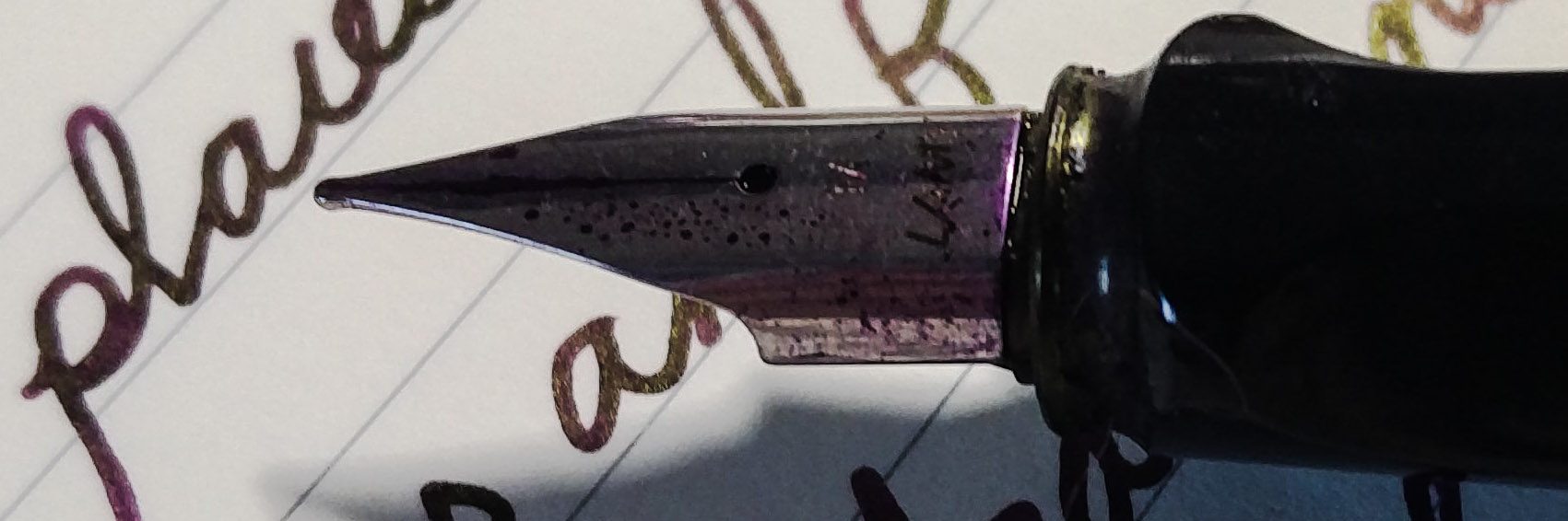
I will say off the bat: all of these inks behave very well. None are excessively wet or dry, they all glide about inkily as an ink should. They don’t take too long to dry, they don’t come out all watery and crap, and they don’t steal your credit cards and take the next flight to Mexico. Not until the end of the lockdown, anyway. You can put them into pens! And then onto paper! For… WORDS! It’s Diamine. The reliability and safety of these inks is pretty much a given.
As you’d probably expect, the Standard group is the biggest. It has twelve inks in it, one of which was left in my office so isn’t shown here.

There are a couple of colours I really like in there. Fire Embers is a delicious face-melting orange, a bit like Monteverde Mandarin but with some extra red in the mix. It really does have that ember feel to it. Except you can’t use it to bake potatoes. Mulled Wine is also a nice, well, wine colour. Both of these somehow manage to have in-your-face pigment but also decent shading.
But here’s the thing with these standard inks. There are twelve of them, and four of those are brown. Why are four of them brown? It seems like more brown than the situation required. I don’t know that there’s necessarily a good quantity of brown ink. I don’t much like brown ink, and I can’t think of any situation in which I’ve considered which ink to write a letter / chapter / committee minutes first draft shenanigans in, and thought that any shade of brown was really calling out to me. I suppose they’re not the worst browns I’ve ever seen. Only Gingerbread is really giving off the soiled nappy vibe to me. Nutcracker is barely on the brown side of red, and while it claims to be standard, there’s a hefty whack of sheen creeping in there. Incidentally, why is Nutcracker brown? Nuts are brown. Nutcrackers are usually metal, no? Roasted Chestnut is rich, it’s vibrant, and it’s bloody BROWN. What’s with the brown?
There’s Purple Bow, which is quite nice. There’s gold sheen in there. It’s probably marked as standard rather than sheen because it’s not the kind of sheen that punches you in the face (we’ll get onto those ones) but it’s definitely there if you use a wet nib. I did all of these samples with the esteemed Lord Dippington, and I think you can see how the ink will look from a wetter or dryer nib as a result. Diamine have a lot of nice dark purples with a hint of gold, and I doubt that this one is going to garner much attention as a result but if that’s the colour you want in your life, Purple Bow has got you covered. Probably literally, because you’re a fountain pen user and you’ve just exploded ink all over your trousers. There are two fairly run of the mill greens and three pinky reds. I do like a bright red, but I think perhaps these three are a little close. With all the other colours in the visible spectrum just sitting there, did we need all three of these?

- Caption: three pink-red buddos just hanging out together.
Ho Ho Ho (the missing one) is… another bright red, albeit a bit more of a true red, with a orangey glow behind it. So: four reds, one red-orange, four browns, two greens and one purple. There could have been more bases covered. How about a goddamn blue? I don’t even like blue ink all that much, but I feel that it should at least be THERE. Grey? Black? Turquoise? Yellow? As Diamine’s most leghumping lapdog of fangirls, I’m sorry to say that I feel a bit like they phoned it in with the standards. Not in terms of the individual shades, but the range of them.
Before I get onto the sheens and shimmers, a quick note on these kinds of ink, lest I should be part of the World of Newbie Pen Nerd Disappointment with any of my photos.
Many newbie pen nerds look them up, see what they can do and get wildly excited. Then they surface in discussion forums, sad about the flat boring and non shiny colours they got. Sometimes it’s a simple thing like “did you shake the shimmer ink before you filled the pen?” But sometimes it’s because of one of the following:
- The paper used. To bring out the best in these inks, you need a non-absorbent paper. The ink must dry slowly on the page by evaporation rather than sinking into the fibres.
- The pen used. You want one that lays down as much ink as possible. Think a broad nib gusher.
- The reviewer probably splashed a big puddle onto the page and left it to dry for as long as it took. That’s not how you write.
- The photos of sheening ink are usually taken at an angle rather than using a flat scanner. I’m going to do this for some of the shimmer and sheen inks because that’s how you show their full glory. When you’re looking straight at a sheenbeast, parallel to it, it’ll be less dramatic.
So let’s move on to the sheenies. What happened in the last couple of years – I think I’ve alluded to it before – is that a couple of other companies brought out total sheenbeasts. Blackstone, Robert Oster and Organic Studios led the charge.
I love Robert Oster dearly because he really seems like a lovely chap. His ethics are strong. But it’s a little odd to me now that his Fire and Ice ink was considered such a trailblazing sheen beast when it came out. Yes, it’s a blue with red sheen, but that sheen is actually fairly subtle when you consider the sheeny arms race that followed. What’s more, our man Robert seems to be a little bit stuck in a rut. The guy has a lot of red-sheening blues. Many of them are released as limited editions for one pen show or another. But even the ones that are always out there are a bit, well….

- Caption: Robert Oster’s selection of VERY EXTREMELY VARIABLE blues.
If you’re looking at this and thinking “wow, those are some varied blues if ever I saw them, you can buy these at the place I swiped this photo from.
If you can tell all of these apart in a lineup you have a better eye than me. (And that’s not all – there’s a Teals section, many of which look more like… red-sheening blues.) Many of them are pretty, but they also cost around £16 for 50ml in a plastic bottle. Recently Diamine joined the sheenbeast party with some stunners. They now do better sheenbeasts than Robert Oster for about £10 for 80ml in glass. What’s more, it’s an opportunity to own inks named Maureen and Robert. Who doesn’t want that? The only thing that annoys me about this is that Robert is a green-sheening purple, rather than the red-sheening blue that we all know it should have been.
This price differential is probably at least partly down to the fact that Diamine are British, Oster is Australian, and the pound is in the shit right now. But it is putting me off Buddo Oster’s inks. Also: how did he manage to trademark True Blue? Did the trademark guys just say: “Well, it’s an odd one, but have you seen how much Robert Oster freaking loves blue?
At around the same time, (correct me if I’m wrong)(3) J. Herbin were rocking the shimmer market that nobody knew existed with their iconic (but pricey) 1670 inks. Emerald of Chivor really is a classic and if you don’t already own it you should go and buy it now. It’s not like you have anywhere to go but the internet.
In each case, Diamine seems to have held back and then said “Wait, that was what you wanted all along? Shit, we are SO on that now. Hold my beer.” Then they reappeared a little later with a range of product that was much better than whatever inspired it.(4) Every year they bring out a new range of shimmers, and we’re now up to 40 on the market in their standard range, along with the new ones in the Inkvent calendar. Recently they’ve started turning out the sheenies apace. I’ve already blogged about some of these. Now let’s look at the Inkvent ones.

- Caption: bunch o’ sheens.
Most sheening inks are one of the following: red-sheening blue, green or teal, gold- or green-sheening purple, or green-sheening red or orange. I’m not sure if it’s even possible to create usable sheen outside of these combinations. We have a selection of them in the calendar and they’re really rather lovely. Holly is a real beast, coming out in a distinctive red and green – I’ve never seen a green quite like that. Polar Glow and Festive Cheer are pretty standard red-sheening blues although they’re sufficiently distinct shades that that doesn’t bother me. Midnight Hour is blue-black and red, with a little purple tinge to it. Season’s Greetings is like a darker version of Smoke on the Water and quite beautiful. I dig all of these sheenies, although I probably won’t use the blues much. Holly and Noel are getting glomped straight up though. It’s a little surprising to me that they didn’t include a gold-sheening purple (not in this section anyway – one of the shimmer and sheen ones falls into that category). That seems like an obviously festive colour to my mind.
Now let’s talk about shimmers.

Not so many of these. One of them, Blue Peppermint, a vibrant, light turquoise with silver shimmer. It’s among the ones I left in my office. It’s lovely, so look it up in a review written by someone more organised than me. The closest alternative is Diamine’s own Spearmint Diva, but it’s not a perfect match. Blue Peppermint is more blue, has something of a glow behind it, and the sparkles have a little bit of a blue tint to them. I’m pleased to see that, because many of us were finding the gold/silver options a bit samey.(5) Golden Star is lovely, but I probably wouldn’t be able to tell it apart from Diamine Golden Sands. Maybe it’s a bit more orangey. I think it is. Solstice is dark brown (brown again?) with a green tint to the shimmer. A bold move. I wouldn’t choose it for myself, but it’s different. Snow Storm is nice, but it’s nothing new: a dead ringer for Diamine Moon Dust. All of this might be a little bit unfair, if I’m honest. Diamine have so many shimmer inks these days that it must be really difficult to come up with new shades. I will be delighted if they continue to switch up the shimmer though.
Then the crown upon the whole lot. Shimmer AND sheen. This is basically where Diamine just went bonkers, threw every weird thing they had into three inks and I AM HERE FOR THAT. They’re all glorious. Here’s where I get really annoyed with myself, because the Christmas Day ink, Happy Holidays, is the most beautiful of all and it’s one I left in the office. It’s a red sheening blue with copious sparkle and it looks like… well… Here’s the problem. There’s so much in each of these inks that it’s difficult to describe them because the pen, paper, light and what the ink had for breakfast make such a big difference. Happy Holidays is a red-sheening blue, but depending on these factors it can look bright blue or almost black, or if the sheen takes over it’s pillarbox red. Sometimes it looks purple. Sometimes it’s almost a deep sea green. It’s a bloody weird ink and it’s amazing. Just go and buy some. Here’s a photo I stole from the Witch of Medway.

With the other two, I have writing samples. So here’s a good opportunity to show how you can get a completely different photo, not just from the same ink, but from the same writing sample.

- Jumpin’ Jack Frost
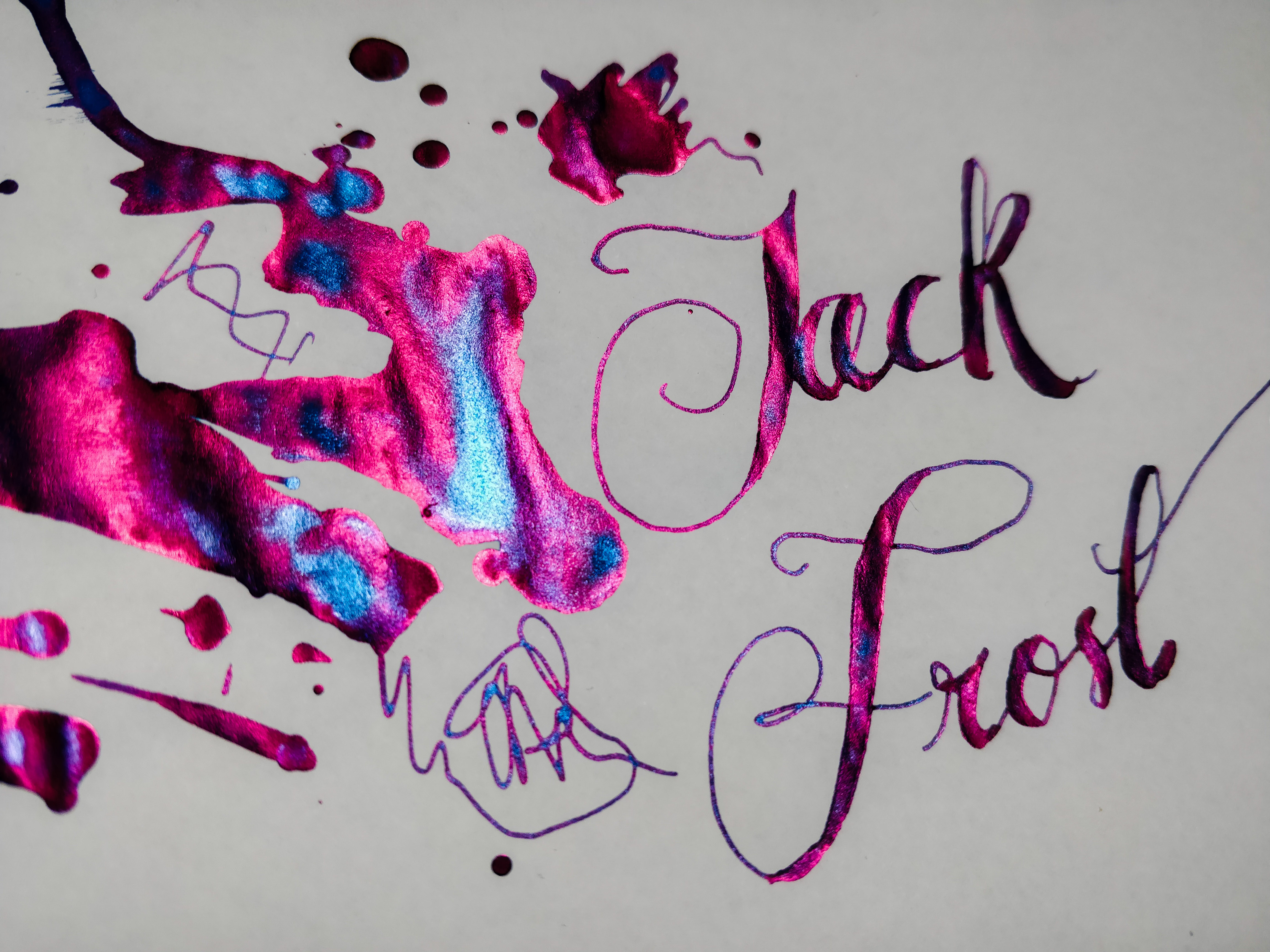
- It’s a blost blost blost
Jack Frost is a pink-sheening blue. The sheen is crazypants and glows in the light. The shimmer is in ultra-fine particles, and the result is that this doesn’t so much look like it’s full of glitter. It looks like both pink and blue are sheen. The differences in the light reflection make a flat surface look like it’s covered in snow drifts. Holy shit this stuff is awesome.

- Here be miracles
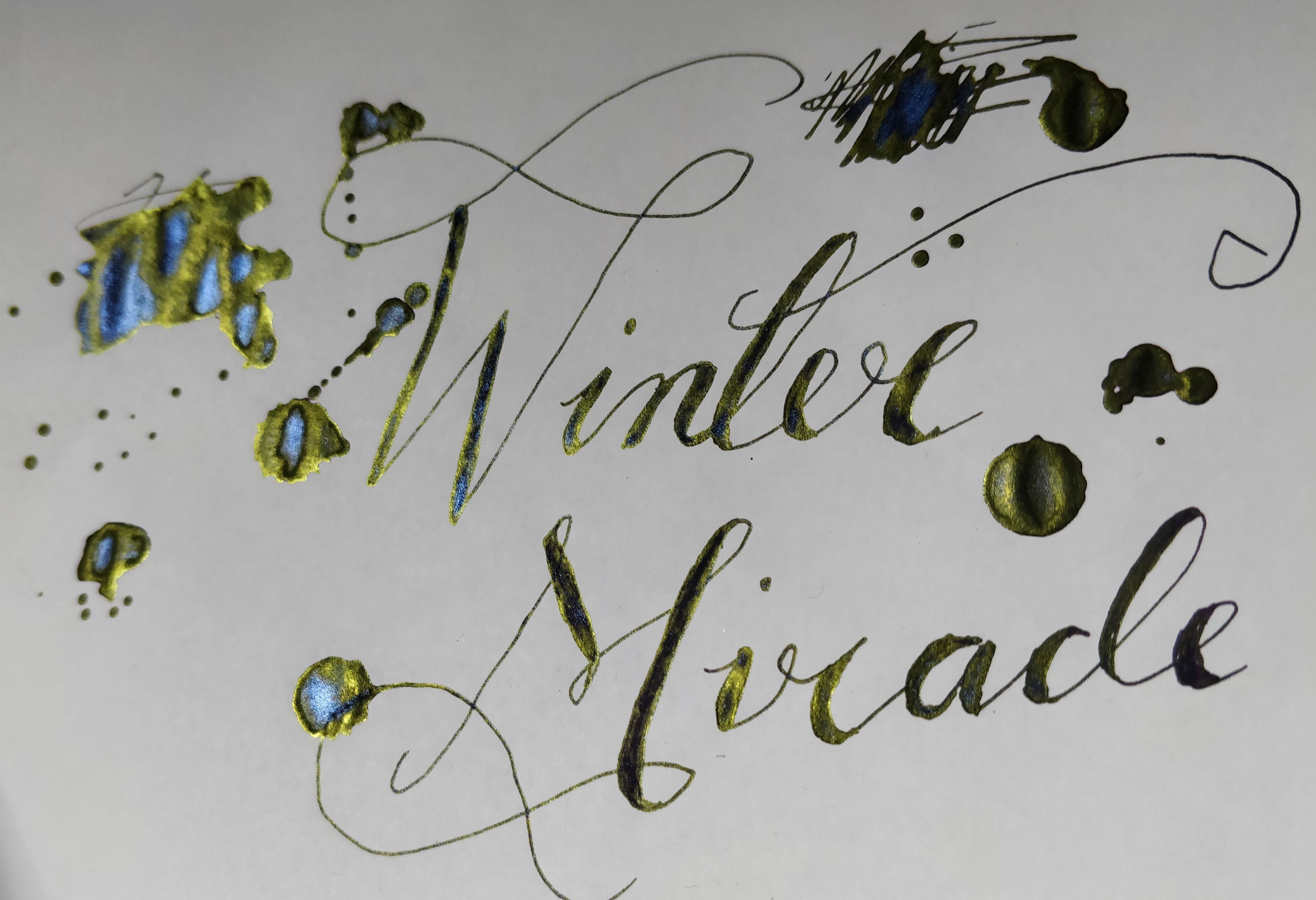
- No seriously what even happened here?
Winter Miracle is similarly strange. This is a purple ink. Honestly, it is. On Oxford Optik paper it’s quite clearly purple.

But when I use it on Tomoe River, there’s no purple to be seen. The green-gold sheen, and the blue shimmer, take over. It looks like a green ink that sometimes goes blue. You see my issue here? What is a girl to do with this stuff?
Diamine have now released the whole lot, calling them The Blue Collection for some reason, in these extremely weird looking bottles.

You probably think they look awesome, wtf, or a combination of the two. That last one is my feeling. Apparently I’m massively shilling for Cult Pens today, so I should be clear that most of the things I’ve mentioned in this review can be bought from Pure Pens, The Writing Desk and others. If you’re in the US, Goulet Pens is your friend. They haven’t yet caught up with the Inkvent collection, but they will.
(1) I realise this is Old Man Yells At Cloud stuff, and having an extra thing is nice (especially as the 25th brought my favourite of the lot, in a bigger bottle than the others). But when did Advent calendars start having a door on Christmas day? Never happened when I was a kid.
(2) Ha ha ha I don’t do hints. I’m autistic. I just shout at people.
(3) You can tell this is a special interest because I’m willing to be corrected for the purpose of learning more.
(4) With the exception of Herbin’s Emerald of Chivor which really is a stunner.
(5) De Atramentis also offer copper, but their copper range is expensive and a bit of a faff to buy. Your instant impulse upon reading that sentence might be to throw links at me showing how easy it is to get hold of the ol’ De Atramentis Copper Pearlescents. Tell you what would really show me? If you just bought them all for me. That would prove your point.

The Medway Witch likes this!
LikeLiked by 2 people
oh those last ones with the shimmer and the glitter are the whole disco-ball of ink and I MUST simply have some!!! And totally agree with your Emerald du Chivor comments – it’s glorious! I do enjoy a brown ink for some reason. Maybe I like to feel like I’m writing in the 1850s or something, I dunno. Great review, as ever, Emmy! ❤
LikeLiked by 2 people
MY WRITING IS SO WISE IT AUTOMATICALLY TURNS SEPIA WITH WISDOM.
LikeLiked by 1 person